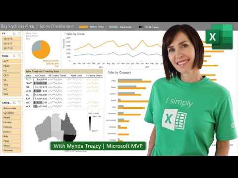
Hi, this is Wayne again with a topic “Intermediate Guide to Excel Dashboards”.
This is the intermediate guide to Excel dashboards and I hope you watched my beginner’s guide to excel dashboards. If you did, you know how I set these up. This is just the beginnings of a dashboard to track certain data. That’S in the rest of my workbook. You can see I’ve got three spreadsheets full of data and I’m highlighting these three pieces of data on my dashboard in this intermediate guide. I’M gon na show how to add some additional functionality to the dashboard.
I’M also going to show you how to dress it up a little bit make it look a little nicer and then we’ll finish by looking at how to pull data from a completely separate workbook and put it on the dashboard on this spreadsheet. So the first thing I’d like to focus on. If you look at this dashboard, this is nice.
I can see the total gross sales and I can see the total number of sales and the average sale price and that’s a good start. But from time to time I might want to dig deeper into the data and to help me with that. I’M going to add some hyperlinks so here on the insert tab and here on the ribbon. I’M just gon na add some text and I’ll click and add the text box here and I’ll.
Just type click for more detail and then I’ll click here on the very edge of the text box and drag it to where I want it to be. I think that looks good. I might want to actually make that smaller, but whatever you want to do, you can adjust the look and feel of that text box. I really should group that text with the rest of this element of the dashboard, but that’s okay for now now I’ll triple click on the text to highlight it or if you prefer, you can click and drag to, highlight it and then go back to the insert Tab insert ribbon and look for the links, group and just click the link button, and this pop-up helps me decide what to link this text to I don’t want it to link to this existing file or any existing file really or to an email address or anything Like that, what I want is this place in this workbook, and maybe I want to focus in on the data – that’s on my 20/20 spreadsheet here.

So click! Ok! So now, when anyone clicks on that button, it takes them directly to the 20/20 spreadsheet and they can see the underlying. Now, going back to my dashboard spreadsheet, I actually might want to adjust that link, so I’m gon na right click on it and go to edit link because notice. It’S taking me directly to cell a1 and gross sales are actually in h1. So I’m gon na change that to h1 click.
Ok, and now, when I click on the hyperlink, it takes me to h1. So that way you can focus right in on the specific cell or part of a spreadsheet that you would like to link to. I could easily do the same thing with links for total number of sales and average sale price. Now, let’s look at some ways.
I can dress up this dashboard and make it look nicer. I could, for example, go into my underlying data here and I could create a chart to add to the dashboard now. This may not make sense in this particular case, but if I wanted to include a chart, I could I could click and drag to highlight. One portion of the chart that I care about maybe the product titles and then holding the ctrl key I’ll move over and click and drag to select units sold.
So, with both of those selected, I’m gon na hold the Alt key and then tap f1 on the keyboard, and that brings up a chart of the data that I’ve selected now, like I said in this case, the chart doesn’t really tell me a whole lot, but Now, with this chart, I can right click on it, cut it and then go to my dashboard and paste in my chart, and this chart has to do with units sold total number of sales. I suppose – and I can put that where I want it to be, and it becomes an important part of my dashboard another way that I can dress up the dashboard is by going to view and looking in the show group. Sometimes I like having the gridlines visible, but other times it just makes it look cluttered, so I’m going to remove the gridlines out of this spreadsheet. If I want to, I can also remove the headings, so I get rid of ABCD, etc and the formula bar here I could uncheck that, and it’s gone now what about the ribbon? If I don’t want the ribbon distracting from my dashboard, it is possible to hide that if you go here to the upper right corner, it says ribbon display options and I can click to auto hide the ribbon.

So it just goes away when I do need it. If I need it, I click here up at the top on the green and the ribbon appears and then, if I click away it hides again now, if you don’t want that, you can have it show, tabs it’ll only show the tabs or you can have it. Just do the default show, tabs and commands I’m gon na go back and auto hide the ribbon completely and now watch. If I go back to the 2020 spread sheet or the 2019 spread sheet or 2018, you notice that the ribbon is still gone.
It’S Auto hidden, but I still do have the gridlines. I still have my headings and so at least the options that I selected here in the View, tab in the show group those apply just to this particular spreadsheet that I’m working on and setting up. As my dashboard, so that’s a good thing to know so the point of doing all of that is just to make the dashboard look nicer. We want it to look attractive and to simply show the data that is important to me or to my audience, or to the shareholders or whomever your audience is another way to do that.
To make it look, a little nicer is to adjust the zoom level, and this is already pretty well zoomed in, but I want to adjust it a little bit and normally I have in the lower right corner some zoom options, a slider, basically that I can use To adjust the zoom because I’ve hidden the ribbon, that option is gone, but if I click here up above on the green, it brings back that zoom level slider. So I’d like to zoom in a little bit, so I’m dragging that to the right. That’S a little too much. I can just use trial and error to get that to the proper zoom that I want for it, and then I can click, and I think that looks really pretty good. If I want to, I can pull this over a little bit to make that really centered well and look the way. I want it to look now. The final thing I want to show you how to do is to pull data not from another spreadsheet. In the current workbook, but rather from a completely different, Excel workbook, so you can see when I put my mouse down here on the excel symbol on my taskbar.
It pops up with two workbooks, the one I’ve been working in and a second workbook, where I’m tracking competitor average sales. Let’S say the company’s competitors publish their data of their average sale price going back his, and I want to use some of this information in my dashboard. Let’S look at how to do that.
First of all, I want to add another dashboard element. I could just copy/paste what I have here, so I clicked on it to highlight it: ctrl C, to copy ctrl V to paste, and now I’ve got another dashboard element now I’ll adjust the text instead of average sale, price I’ll call, this competitors average sale price. My text is way too big, so I select it and I’ll shrink down the text.
Still too big there we go and of course I could have just adjusted the size of the box that the text is in, but now the data itself I’m going to double click on it and I get a cursor and I can delete that text because I Want to pull the number that goes here from that other separate workbook, so next i’m gon na click away from my shape and to do this properly. I think it makes more sense if i click to bring back my ribbon and then i put in the formula bar and i think i’ll make the ribbon stay, at least for now so show tabs and ribbon. So now I’ll click on my shape and delete the number that was there already and with the cursor flashing.
I’M gon na go up here and type equals here in the formula bar and then I’ll just hold the Alt key and tap tab. And that shows me all of the options of the different windows and files that are open. I had to tap tab a couple of times until I selected the workbook that has the data I want to pull, and here it is 20/20 average sale price of my competitor, and I select that sell tap, enter on the keyboard and look it’s now pulling information For my dashboard, but it’s pulling it from a separate workbook completely.
I’M gon na go back to my workbook and the dashboard that I’m working on. Obviously I could change the text. I could work to change the color scheme and things like that. I could change the background.
Color try to change the text color, but honestly, I’m pretty happy with the way it is right now and now I can save this workbook and my dashboard should always have a connection between this workbook and the other workbook that I’m pulling the data from. So if this number gets updated in my second work, it should update also on my dashboard in the current workbook. Now, if you pull data, often from other workbooks into a dashboard from time to time, you may run into some problems. What, if that other workbook gets deleted, what if it gets moved the link might get corrupted? So, if that happens, what you’ll want to do is go to the data tab and look in the queries and connections group there.
It says edit links, so you can click that and it will show you the links that it has. So this workbook only has the one link that I just created. I can click on it and click check status and it tells me the source is open. So I’ve got a good connection and the source is open.
Now, if I close this pop-up and go in and close that second workbook, that I’m pulling the information from, I can go back to the data tab, queries in connections, group click, Edit links and this time, if I click check status, it’s got a connection still but Notice there is a warning values, referring to other workbooks were not updated, so I could click update values and that should update the values. I can change my source. I can open the source by clicking open source. It opens that other workbook there’s just quite a lot of options that I have here to help me make sure that my links to other workbooks are still valid and working.
So this has been the intermediate guide to Excel dashboards from here. You could keep adding more data, more visual elements like graphs and charts and make it look better and better and pull together just the information that you want to highlight onto your dashboard, thanks for watching. If you found this tutorial to be helpful, please like follow and subscribe and when you do subscribe, click the bell next to the subscribe button, so that you’ll be notified. Whenever I post another video, if you’d like to support my channel, become a supporter of mine through my patreon account and you’ll, see a link to that in the description below .