Hi, this is Wayne again with a topic “Inside Google’s massive Android rebrand”.
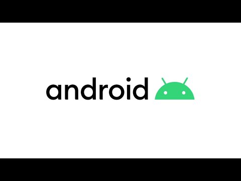
Google is rebranding Android and it’s probably not as complicated as you think it is, but it’s not really that simple either now before we get into it, Android is still Android. I personally thought that they were going to rebrand it to like Google OS since they’ve been slowly moving a lot of their products towards the Google umbrella, but no Android is still Android, at least for the time being. Now the bulk of the story revolves around the fact that Google is trying to make Android more accessible there’s over 2.5 billion Android devices active on the planet right now, which means that Google wants Android to be easy for everybody to use and i/o this year they Launched a bunch of new accessibility features and they’re slowly making Android a ubiquitous platform that works for pretty much everybody. So, let’s start with color. Now when indra was founded, it was this limey green color and in 2014 Google changed the color to be this more dark. Foresty color, that represents the Android logo that you note today. But if you take a look at that logo from an accessibility standpoint, it doesn’t make a lot of sense. This is Sidney. Toma show her team realized.
If you add some color to the green, it becomes a lot easier for more people to see. Add that to it, the fact that it works a lot better with different branding, colors and you’ve got yourself a winner. What we did is we took our existing Android green and we actually added a little bit more blue into it, so these team basically went and created a whole palette of new branding colors for Android you’re, still using green in the traditional android logo. But it’s added some blue to it to make it a little bit easier to see and that actually makes it fit a little bit better with the official Google logo which uses blue as well.
We will also decided to use colors like orange and navy, which is a little more contrasting with that green. It makes it a little bit easier to see and it also makes packaging a lot easier to put together, but the color is not the only thing that shifted. The actual logo of Android has changed.

Now. You’Ve probably used to the Android robot with the arms and legs making a peace sign, but Google has decided to simplify it. They basically just kept the head shifted the antennas by one degree, and the eye is down very slightly to make it feel more human. An unimportant part of character design is how much emotion, you’re able to portray with the fewest elements and go, has basically gotten rid of most of the elements in the original Android logo. Now you’ve just got the head with the antenna and the eyes.
They’Ve shifted the antenna by about one degree, and they brought the eyes down a little bit to make. It feel more emotive in human and Google is going to do things like shifting the antenna to the right and left to show direction or blink up and down and move the eyes to show that emotion. They’Ve done a pretty good job with conveying a similar amount of emotion with a smaller amount of Android, and I think that that’s good for everyone – and you probably didn’t notice, but the word mark for the Android logo has also changed. It’S really similar to how it was in the 2014 version, but they added curves to the bottom of each of the letters to make it work a little bit better with the Android head.
The curvature on those letters has the same radius as it is with Android heads, so it makes it feel like part of a family. Now, there’s not an official font for Android word mark, but it now appears together with the Android head logo. So Google is really trying to make these things be together, but not necessarily the same. And finally, we moved to the Android versions and it’s a bit of a sad day, because Google is officially getting rid of the version names and they are moving to version numbers. So Android QED is officially Android. 10.
No, no you’re, probably a little bit upset about this, but in some countries that makes a lot of sense. Some people might not even know what marshmallows are and does anyone really know how to say nougat nougat nougat anyway, so you’ll be seeing Android version numbers from here on out, but Google did assure me that they were going to keep having code names for each of These versions so for the real geeks out there that really want to know what Google is calling this internally. That will still persist.
This brand evolution is really way for Google to make Android feel like more of a part of the Google family and not a separate entity. It’S also focusing really big on accessibility, which i think is really important for an ecosystem that has over 2.5 billion users. What do you think about the redesign? Let me know in the comment section below and I’ll sign over to the article and Android komm, because I’ve got animations and photos and word marks and pretty much all the assets that are going to go into this new Android of redesign so I’ll catch you in The next article .